Reflections on Views
How do façade choices affect view quality?
Lisa Heschong, a keynote speaker at the Facade Tectonics Institute’s World Congress in October, is a strong proponent for the importance of daylighting and views in all types of buildings. In this excerpt from her recent book, Visual Design in Architecture: Daylight, Vision, and View, she discusses a number of the fenestration characteristics that contribute to, or detract from, coherence and clarity of views. Given the variety of design options and concerns, we still are a long way off from developing a set of view performance metrics.
We can ask: “What constitutes a good view”? In some ways this is a ridiculously simple question, yet in other ways, it is a surprisingly difficult one, perhaps because there is so much complexity. Certainly, we know that people have strong feelings about views. Real estate investors pay millions of dollars for property with the potential for a good view. Landscape artists spend a lifetime painting views that inspire or intrigue them. Landscape architects devote their professional careers to designing views in the hope that others will consider them beautiful, tranquil, or fascinating. There are also a few researchers who have tackled the issue, trying to categorize better versus worse, although most would agree that rigorous research on views is in its infancy.[i] The simplest answer is perhaps the most obvious: a “good view” is the one that people most want to look at.
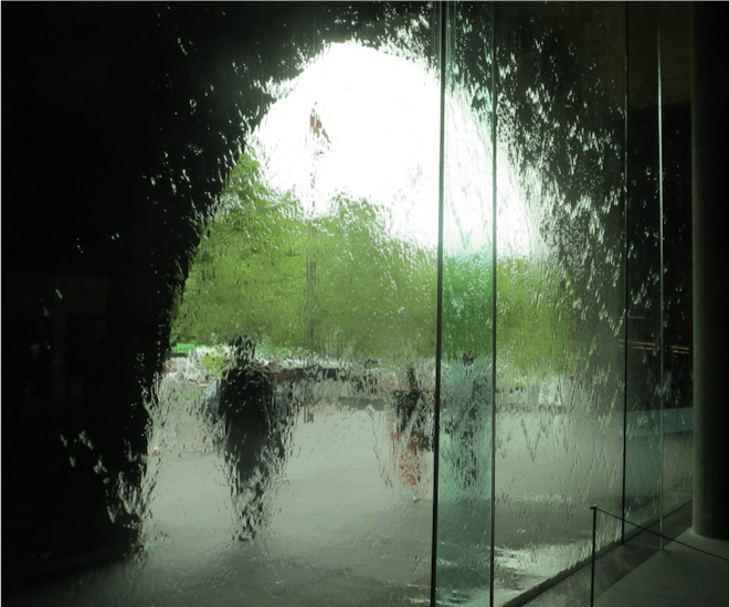
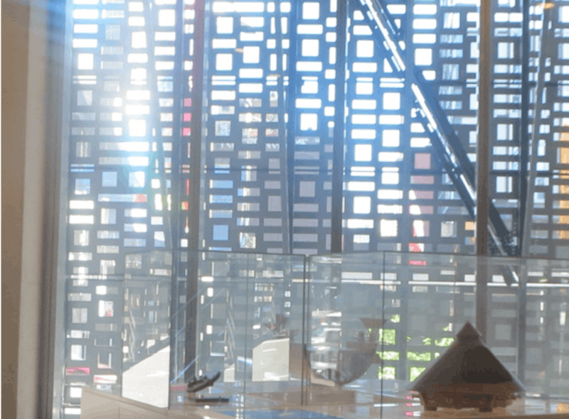
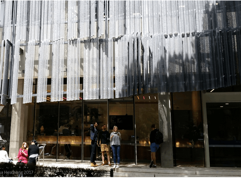
A scrim of falling water creates a mottled, painterly view through street level windows., at the National Gallery of Victoria, Melbourne, Australia
Time, Change and Motion
How often do we feel a need to look at a view? This is an essential question to answer, as it then dictates how we design buildings to allow access to views. Can your desire for a view be satisfied with a once-in-a-lifetime event, like visiting Niagara Falls or the Taj Mahal? Is it a view you feel a need to see yearly, perhaps like your home town dressed up for the holidays? Or weekly, daily, hourly, or even every few minutes, like a friend I observed while she was busy typing a report, who glanced out the window every two to three minutes?
I think one key determinant of how often we want to look at a view may be how much it changes, and how quickly it changes. But change has many other characteristics in addition to speed—such as steady versus intermittent, rhythmic versus random, predictable versus unpredictable, permanent versus fleeting—which all influence our desire to look at a view.
An obvious type of change is simply a result of daily weather, which is much more entertaining in some places than others. Predictable seasonal changes in vegetation, animal or human behavior are all of interest. Alternatively, a rapidly evolving vista, such as a construction project transforming from a hole in the ground to a finished building, sustains curiosity in the present and adds temporal perspective in the future. Many other intermittent events—such as street parties, parades, fireworks, or special holiday markets—give extra meaning to a window view, adding both memories of the past event and anticipation of the next.
Unpredictability increases the frequency with which one wants to ‘check’ a view. Many people who treasure a view of a nearby mountain find themselves checking frequently to see if it is currently visible through the clouds, and if so, how its form and color is changing throughout the day. Mount Hood, a classic conic volcano, is one of the most important landmarks for Portland, Oregon, but it is often hidden behind the region’s thick cloud cover. When in view, depending on atmospheric conditions, its appearance varies from a vivid rock-solid presence to merely the faintest ghost hovering far off in the sky.
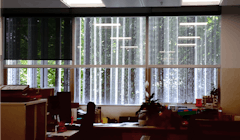
I encountered an extreme example of the importance of intermittent events at a daylighting study site at an engineering building at the Naval Base in Norfolk Virginia. The south-facing façade had continuous, ten-foot high windows, covered with horizontal mini-blinds, which were typically kept fully closed to block the southern sunlight. Only at the very bottom of the window, from about 2 to 4 feet above the floor, was kept clear of blinds. We substituted an innovative sun-light redirecting film for the top two feet of mini-blinds, which brought substantially more daylight into the space. Then we asked the workers, siting in their cubicles, how they liked the change. Instead of appreciating the greater amount of daylight illumination, a number of them complained that the new film “blocked their view.” I found this very surprising. I could not understand how the film could be newly blocking a view that was previously blocked by closed blinds.
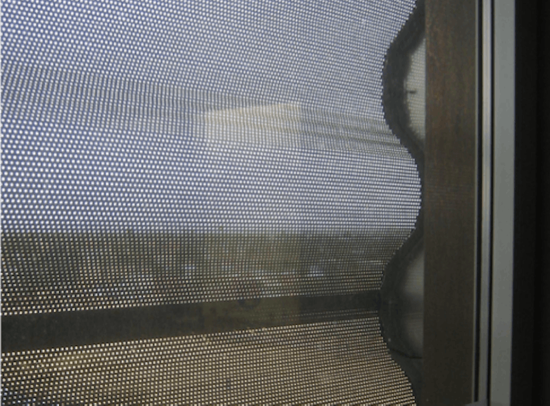
Then one of the engineers took me aside to explain the situation in more detail. This office building faced directly at the practice landing strip where new pilots were being trained to take off and land on a pretend aircraft carrier. Usually, the new pilots did well, but there were occasional mishaps, which were always big news around the base. Even though the mini-blinds were always closed, they did have pin-hole perforations, which were just enough to reveal the shadow of an airplane approaching the field for a landing. The office occupants could see the upper two feet of the windows over the top of their cubicles, and when they noticed a bit of airplane shadow moving across the blinds , they had just enough time to glance around their cubical partition, and look out the clear bottom two feet of the window, in order to observe the landing. The sunlight redirecting film we had installed blurred the image of the sky and the plane, so they could no longer correctly anticipate when to watch a landing. That was the problem.
So here, in this story, we have a very occasional and unpredictable event—a landing mishap—driving the occupants’ valuation of the importance of their view. And the prompt for this event was derived from the tiniest amount of visual information—shadows seen through the pin-hole perforations of an opaque blind—from the top two feet of a ten-foot high window. That’s when I realized how even the most minimal information provided by a window could still be highly valued as ‘a view’ by office workers.
Psychologists would describe the tiny moving dots of the airplanes as ‘an alerting event’, one that captures our attention and directs the focal area of our eyes to look for more information. Thus, detecting that little bit of movement is the essential first step in gathering the desired information from the window view. This, of course, assumes that the information is ‘desired’ and welcome. It could also be possible that the ‘alerting event’ is an unwelcome distraction. Preventing such distractions has long been a justification for creating workplaces and classrooms with few or no windows.
Managing the balance between welcome and unwelcome distractions, balancing outward views and inward privacy, is another piece of the equation in the design of windows and their attachments Both the flow of daylight in and the clarity of the view out is hugely determined not only by the choice of window treatments, but also by who has the prerogative to select that system and who has the authority to operate it, as illustrated in the next set of stories. These stories address the question of how filtered or fractured can a view be and still be valued? At what point does a partial or eroded view produce more frustration than pleasure?
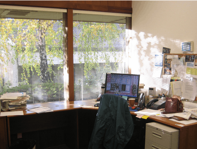
Dappled sunlight through an aspen tree, further filtered by mini-blinds, provides motion and interest to an otherwise obstructed view out.
Filtered or Fractured Views
Long before the Norfolk study, I had conducted a similar set of interviews with employees of a bank in Vancouver, Canada which provided some interesting insights about workers’ relationships with windows. One manager had a private office with a large window looking north over the strip-mall parking lot. The upper one-third of the window was clear, allowing a view of the sky, while the lower two-thirds had been obscured with a frosted film, presumably for privacy. He received plenty of daylight from both the upper window and the lower frosted section, and he could see vague shadows of people passing by on the adjacent sidewalk. When asked about his window, he said he found it extremely annoying, as he “couldn’t see out”. He wanted to know who was walking by his window: was it his next appointment showing up? And even worse, sometimes he could hear an argument or a crash in the parking lot beyond, and then he felt compelled to climb up on his chair so that he could see what was happening. To him, his big window was just a tease. It provided him with alerting events—shadows or noises—but no resolution. The manager next door had a similar office arrangement, but instead of the frosted film on the lower window she had vertical blinds, which she kept mostly closed. She could easily peek through them if need be. She had no complaints.
Some other workers at the same bank had desks arrayed along windows fronting the street, which provided valuable real estate for corporate advertising. Huge framed posters hung in some, filling most of the glazing area. Little 4-inch slices of clear glass remained at the sides and bottoms of the posters. All other windows were completely covered with giant images of happy customers, printed on perforated vinyl wrap.
The people working next to the opaque posters reported feeling distracted and annoyed by their little slices of view. Traffic outside flashed by too quickly for them to understand. They generally tried to ignore the windows, even shielding their eyes with their hands. However, they explained, they occasionally did peek outside by putting their nose right up to glass. They appreciated the ability to do so.
The people sitting next to the vinyl wrap were more content with their windows, and less distracted by the movements outside, since they could detect the blurry but coherent shapes of people and cars through the pinholes. They did, however, feel a bit oppressed by the giant faces looming above, and reported that they didn’t feel like they were sitting next to a real window.
In both cases, understanding the movement of people and cars outside largely determined their satisfaction with the view. The first group, sitting next to the paper posters, had clarity, but no continuity. Because their view was fragmented into little slices, it become incoherent and frustrating. The second group had continuity, but little clarity. While detail was missing, they could still detect big objects and big movements.
The most common form of filtered view is surely just through a dirty window. The gradual accumulation of dirt and grime on a window can be imperceptible, very slowly and uniformly fading its light and eroding the clarity of a view. I personally associate dirty windows with old and forgotten places, attics and basements that have been uninhabited for years. I have sometimes walked into an old barn or factory and been amazed at the buildup of dust, dirt and cobwebs that obscure windows almost to the point of opacity. Thus, hazy windows can imply poor maintenance and disrespect for the occupants. In contrast, clean glass has a crisp sparkle that accentuates the immediacy of whatever life is taking place outside.
Films and ceramic frits adhered to the surface of the glass can also create a variety of obscure patterns, and they have the advantage that they are applied in controlled patterns, allowing clear and obscure glass to alternate. These techniques allow a designer to choose the right amount of clarity versus translucence, a balance that allows just enough of both privacy and view without inducing too much frustration. Getting that balance right may require some artistry. If that bank manager in Vancouver had just a few small voids of clear glass in his frosted window, he might have been less frustrated!
Indeed, obscure or frosted films and frits can now be manufactured to create almost any conceivable two-toned, two-dimensional design: a decorative pattern permanently frozen onto the glass surface. Elaborate geometric or floral patterns, logos, maps, even photo-realistic portraits, are not much more difficult to implement than simple stripes or screens. In this case, the design printed on the glass becomes itself both a filter and the intended view, much like an antique lace curtain displayed in a door’s window. The scale of the pattern, the regularity of the voids, and importantly, the balance of light on either side of the glass, determines which is seen as dominant: the view beyond the glass or the design printed upon it.
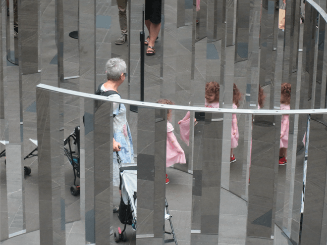
Reality is sliced up and replicated into a dozen pieces via reflections, prisms and slots in the sculptural piece, “Semicircular Space” , by Jeppe Hein. Reflective surfaces, indoors and out, sometimes have unexpected impacts on the quality of views.
Veiling and Scrims
Theatrical designers have long known a secret of using a scrim, a tautly-stretched, gauzy fabric as a backdrop for their stage sets: an image painted on the scrim, such as a street facade, will seem completely solid when it is brightly illuminated from the audience side. However, as the light balance changes, so that the actors behind the scrim become more brightly lit, then the scrim eventually disappears from view as the audience looks beyond it. Our eyes look through the darker surface and pay attention to the brighter objects beyond. The darker the fabric, the easier it is to see through, as the dark threads scatter less light, causing less interference with the view.
This principle also applies to almost any kind of architectural screen, whether fabric, metal or printed on glass. When the surface of the screen in front of you is most brightly lit, you see the surface as opaque. Whenever objects behind the screen are more brightly lit than the surface of the screen, it appears transparent. This means that a sunlit mesh shade will mostly block a view to the shadowed scene outside. The effect reverses at night when the room is more brightly lit than the outdoors. Then, screens that provide privacy to an interior room during the day become transparent in the other direction: allowing outsiders to look in, while preventing the occupants from seeing out.
Moghul India transformed architectural partitions into a high art form. Beautifully carved wood and stone screens, with elaborate geometric and floral arabesque designs, called jali (from the Hindi/Urdu word for ‘net’) became an integral part of Indo-Islamic architecture. While found in some temples and mosques, jali were most commonly used in the women’s quarters of homes and palaces to provide privacy and security, along with ample ventilation and a filtered view of the outside world. Persian artisans preferred geometric designs, while indigenous Hindu artisans created elaborate florals and arabesques. The perforated stone provided enough depth to create shade from the sun overhead, and also increased the surface area for heat exchange, absorbing some of the heat of the day, to cool the ventilation air as it passed through. They were artful, while providing privacy and cool shadows. Thus, the jali were a form of extreme luxury: architectural lace.
Architects have recently been experimenting with perforated metal sheets as solar screens on outside of buildings: you can think of these as permanent architectural scrims, or jali produced on an industrial scale. Originally the metal screens were created with simple mechanical hole punches that produced regular circle or square voids, but now highly elaborate and intricate patterns are possible using digitally-controlled laser-cutting technology, just as with the films and frits discussed above. Perforation patterns can be reproduced at monumental scales, likely with far more attention to the uniqueness of the design than the quality of the view through it. These buildings are being veiled, hidden behind perforation patterns that create both images and shadows, thin two-dimensional patterns that dominate the definition of a façade.
At what point does the veil create a sense of imprisonment instead of protection or privilege? I have been wondering about that question since one of our early school studies at Heschong Mahone Group found that children in classrooms that had some form of security protection around the windows, such as bars, perforated metal screens or plastic security glazing (usually scratched and yellowed), made significantly less academic progress over the school year.[i] We were assured by the school administrators that these security measures were left over from previous uses, like last year’s computer lab, and did not reflect on the type of students assigned to those classrooms. Other systems of reducing daylight and view, like tints, curtains, blinds, or pictures taped to the windows, didn’t have such an obvious negative effect on student performance. Thus, the most likely explanation for our finding was some kind of psychological effect on the students implying constraint or deprivation.
[i] Heschong, L et al “Windows and Classrooms” California Energy Commission, PIER program, report P500-03-082-A-7, October 2003
Reflections
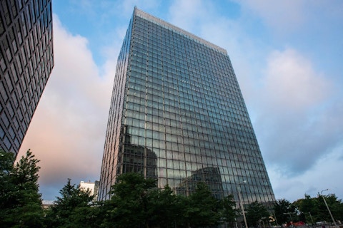
Another type of filter that can create even more ambiguity is mirrored surfaces. The first mirrored surface was undoubtedly quiet water, when one of our hominoid ancestors first looked down and recognized her own face, much like Narcissus in Greek mythology, enraptured by his reflection in a pool of water. Clear calm water can allow us to both look down through the water, to see pebbles or fish, and see an upward reflection at the same time. Polished glass is also partially reflective under the right conditions, reflecting best at glancing angles and when the light balance is brightest on the observer’s side. Jalousie windows, common in humid tropical climates like Hawaii and India, present an interesting example. They consist of operable horizontal strips of glass shingled downward to allow ample ventilation while shedding rain. . The angled glass differentially reflects light, and can create layered strata of view/reflection/view/reflection that allow the observer to see both inward and outward simultaneously.
Some conceptual artists have been playing with the idea of interlaced views and reflections on a monumental scale, creating mirrored outdoor sculptures that create immersive mazes for people to walk through, experiencing the confusion of fractured views. Imagine wandering through a miniature Stonehenge built of perfectly reflecting mirrors, whose purpose is not to orient you, but rather to disorient you. For example, Danish artist Jeppe Hein’s mirrored sculpture “Semicircular space 2016” was described as: “a nautilus-like labyrinthine…where the physical space and the mirrored space are experienced in an alternating rhythm.” As people walk into the spirals, they see both themselves in multiple narrow reflections, along with staccato slices of other visitors as they pass by. The progressively angled mirrors double the apparent motion, and toy with any conception of a cognitive map, as physical presence and reflection become indistinguishable.[i]
I experienced a prosaic version of this mirrored ambiguity in some workstation partitions that we installed in our company’s offices. We choose a partition system that was opaque up to four feet, then had glass panels above, thinking that it would increase access to view and daylight deeper into the space. What I hadn’t counted on was the partial reflectivity of the glass panels, such that when facing the window, you could also see a subtle reflection of someone standing behind you, and when sitting looking away from the window you could see a transparent reflection of the sunlit trees outside. This was both useful, allowing employees to more easily monitor their surrounds, and enchanting, as the reflected street trees added layers of seasonal color and detail throughout the office.
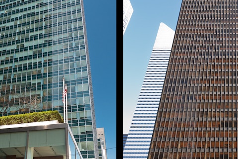
Reflective glass surfaces, however, can also wreck visual havoc when solar reflections and glare are not properly anticipated. A new government office building in San Francisco had a difficult challenge: optimize daylight and view for offices along a large north-west facing façade. The designers choose to mount vertical glass fins around windows to both shade the windows and bounce western sunlight deeper into the space. The glass fins had a sanded finish, likely intended to better diffuse the sunlight, but being translucent, they also further restricted the view. Furthermore, the redirected sunlight translated into intolerable glare for the office workers, resulting in widespread rebellion and eventually, expensive lawsuits. Extensive retrofits added both tinted films and roller shades to reduce the apparent brightness of the sun. However, a post-occupancy evaluation of this building after the retrofits found that occupants were still extremely dissatisfied with the visual conditions, largely because the low angle sun, doubled by its reflection, was both inescapable and disorienting, while the views were fragmented and unsatisfying.[ii]
These stories of reflecting surfaces creating partial transparencies, fragmented views and disorienting reflections again raise questions about how filtered or fragmented can a view be and remain satisfying? Where is the dividing line between ambiguity that is intriguing, versus annoying? What is the relationship between size, scale, distance and movement in determining clarity or continuity? Some insight can be provided via the concept of spatial frequencies.
[i] www.ngv.vic.gov.au/exhibition/jeppe-hein/
[ii] Konis, K. “Evaluating Daylighting Effectiveness and Occupant Visual Comfort in a Side-lit Open-plan Office Building”. Building and Environment, 2013. https://doi.org/10.1016/j.buildenv.2012.09.017
Spatial Frequencies
The mathematical concept of ‘spatial frequency’ offers a useful framework for trying to understand how people respond to views—in terms of understanding how scale, detail, distance, filters and obstructions all interact to impact clarity and coherence. Spatial frequency analysis is derived from Fourier analysis, a branch of physics that studies wave forms and harmonic patterns to describe the distribution, density and interaction of information. Waves, such as sound waves, can be observed to have multiple harmonics, with both big and little waves interacting to form complex patterns.
In the realm of visual perception, spatial frequency describes the scale of details within an image, reported as the number of contrasting cycles per degree of visual angle. Things that we see as very small, whether close up or far away, have high spatial frequency; whereas things that loom larger in our field of view have lower spatial frequency. Because a given object will appear smaller the further away it is from the viewer, spatial frequency accounts for both the size of the object and the position of the viewer. Thus, a row of identical houses, seen in perspective, will exhibit a full range of spatial frequencies, from very low frequencies for those houses closest to the viewer to high frequencies, for those farthest away.
It has been hypothesized that cells in the human retina and visual processing centers are individually tuned to respond to specific spatial frequencies, such as those which are especially important in differentiating human faces and motion. These systems are happiest when they are all acting in concert. Thus, a view that activates the full range of spatial frequency responses will be found more pleasurable than one with a limited range. If so, then logically, a ‘good view’ should include a range of fine details, middle sized objects, and big organizing structures.
I would argue that, in general, the most essential information that we gather from our window views has lower spatial frequencies—such as patterns of light, shadow, and colors—that determine the shape, location and movement of large forms and structures. However, the visual information that we most enjoy are the tiny details—such as identifying faces, the sparkle on a lake, the twigs on a tree or a bird in flight—which all have extremely high spatial frequency.
Indeed, one recent study conducted at the University of Waterloo, Canada, seems to bear out this hypothesis. [i] Researchers there tested the response of 55 undergraduates to paired photographs of somewhat similar urban and natural scenes, and also manipulated the images to reduce various bands of spatial frequencies. They found that the natural scenes of forests or parkland were judged the most pleasant, and also had the highest spatial frequencies. But when the researchers selectively removed the higher spatial frequencies, the emotional distinction between natural and urban views disappeared.

Lisa Heschong
Architect & Author, Visual Delight in Architecture: Daylight, Vision and View
Looking for something specific?
Search our extensive library.
FTI’s SKINS email is the central source for the latest in building skin trends and research.
All emails include an unsubscribe link. You may opt out at any time. See our privacy policy.
